The word "graffiti" comes from the Italian word for "scratchings" as early graffiti (way before the advent of spray paint) was scratched into the walls of ancient Rome. From the beginning a form of street art (or vandalism depending on your point of view), it has been a voice for the disadvantaged and oppressed to validate their identity, howl in protest, or express their creativity. Yet like all organic movements, before long it becomes absorbed into mainstream culture, commercialized, sanitized, and repackaged for mass consumption.
In the 80s there was a resurgence in graffiti in New York City and with the help of gallery owners looking for the "next big thing" there emerged a "graffiti movement." Young "taggers" with no formal art training were brought to exhibit in Soho galleries where rich art patrons sipped cocktails and looked at subway car doors covered in swirling, brightly colored patterns and words. The debate raged (and still rages) over whether these were created by artists or criminals and some are even devoted to the study and preservation of graffiti art. Whether you think they are defacements or art, there is no denying they are a continually changing canvas in the urban landscape (here's a New York City graffiti photo gallery from blogger wacky doodler).
Some fine artists began to incorporate the graffiti aesthetic into their work although they considered themselves outside of the "graffiti movement." Jean-Michel Basquiat (1960-1988) was a middle class artist who created works that seem primitive and crude at first glance, yet they contain not only echoes of street art but also of art history: the scribblings of Cy Twombly (1928- ) and Jean Dubuffet (1901-1985). An enigmatic figure who took his outsider status as a young black man and played off of others preconceptions about his background or personality (here's an interesting recollection by a former studio assistant, John Seed) , Basquiat was a master of his image yet careless about his work. He sought to criticize the very people and society that tried to consume his work, so their acceptance only fueled his rejection of them. And in our "celebrity" culture, his early death of an overdose only cemented his reputation. There is still disagreement over whether he was merely a stylist or an artist with a lasting influence and importance.
Keith Haring (1958-1990) was more successful at packaging his street art for mass consumption and he did so willingly. He began his career making chalk drawings on blank advertising panels in the New York subway system. His iconic drawings of glowing babies, barking dogs, television sets, and dancing people were enigmatic, compelling, and even (dare we say?) cute. The random, transitory nature of these subway drawings lent an element of excitement to his work, giving subways riders a vicarious thrill: could they spot the new drawings? would the artist get caught? who was this mysterious scribbler? After much media attention, Haring became a one-man industry, delving into merchandising, public art projects, and his own store "Pop Stop." His breakdancing figures became entwined with the emerging hip-hop culture and tied to the increasingly visible gay rights movement. At the same time, his animations were showing up on "Sesame Street." His art was truly of and for the people.
Graffiti has even entered into the realm of conceptual and interactive art. One website gives instructions on making "throwies," small magnetic LEDs. Tossing them on metal buildings or walls lets you make your own illuminated graffiti. Check out the video on the site of a crew in action at night creating amazing street art. Best of all, there's no damage to the building and the "throwies" can be reused until the batteries run out.
The debate may never be settled (for the question "but is it art?" has many answers) but the graffiti artist is sure to remain on the scene, whether underground or mainstream, leaving his mark on the human consciousness.
"THE MIND HAS STRONG TEETH. CHEW THINGS WITH THOSE STRONG TEETH. DON'T LET THEM SIMPLY ORNAMENT THE SMILE OF THE STARS..." >> JEAN COCTEAU <<
2.17.2006
2.13.2006
Big Type, Big City
I recently had the opportunity to hear well-known designer Paula Scher (1948- ) speak about her love for typography and New York City and how those two passions intersected. It was a fascinating look at how environment can influence an artist. Even Paula herself admitted that much of it was unconscious and she only became aware of it in retrospect. You may not know her name but you surely have seen her work, especially if you read the New York Times or have visited the city. From the Public Theater to Jazz at Lincoln Center to the Citigroup logo, her mark is all over Manhattan.
Her new book is called "Make It Bigger," a common phrase heard by designers from their clients. In Paula's case, bigger is better. Her typography is bold, assertive, and a major element of the design. The letterforms go beyond communicating words and become design elements themselves. Many of her seminal works reflect the verticality of skyscrapers and the grid of the city streets. In fact, her work was so evocative of New York that it became its own style that was widely appropriated by other designers until it ceased to become Paula's signature. The power of Paula's work was that it was always a vital part of the design message and not an arbitrarily applied style.
Her recent work has gone beyond the printed page into the realm of environmental and architectural design through her association with Pentagram. But even in these 3-dimensional situations, the letterform remains an integral element, climbing up walls, wrapping around stairwells, and looming in giant plexiglas cases. The architecture of the letter is seamlessly joined with the architecture of the building.
She has also taken her fascination with the written word into the realm of fine art in a series of large-scale paintings that combine maps with typography. The words that fill the map with pattern are also a pointed commentary, as in the case of 'Florida 2000' which depicts the results of the Bush/Gore presidential election in visual form. This double impact of form and content lend a compelling depth to a commonplace object. The old saw goes, "A picture is worth a thousand words" but in Paula's world, a picture is a thousand words.
2.07.2006
2.06.2006
Art-ificial
Lately it seems the truth has been broken into a million little pieces. But all this talk of truth vs. lies and fiction vs. fact has brought to mind these same debates in the art world. If the Picasso that you adore hanging on your library wall turns out to be a forgery (and even Picasso is claimed to have said he would sign a very good forgery), does that negate the pleasure looking at it has given you over the years? Ultimately isn't the experience the real truth no matter the 'facts' of the object?
Sometimes even in the face of the truth, some can't overcome their beliefs. In 1984, for the centennial of Amadeo Modigliani (1884-1920) his hometown of Livorno, Italy, drained the canal outside his house, as legend had it he often threw rejected works out the window of his studio. To their amazement they found three stone heads that were proclaimed by art critics to be authentic and a special exhibition was mounted that drew worldwide attention. However three college students soon came forward and claimed to have carved the head as a joke. No one believed them until they produced a video of themselves creating the sculpture. A local dockworker had carved the other two. Needless to say the critics were loath to admit their mistake.
British artist Jamie Shovlin (1978- ) created an exhibit that purported to be the work of a teenage girl Naomi V. Jelish (an anagram of Jamie Shovlin). Her drawings are combined with newspaper clippings and diary entries telling the story of her entire family’s disappearance after a year of personal tragedies. The artist claims he created the exhibit to “test the boundaries of ambiguity.”
Ultimately it all comes down to semantics. As Patsy Stone once quipped, “What’s the difference between a child’s painting and a painting done by a child?” Is it the intent? The innate talent? The value placed on it by a proud parent? Or an art critic’s judgement? Even elephants and chimpanzees have created works of art that, unidentified, could be mistaken for abstract expressionism.
So perhaps art (whether visual or literary) is best judged by the emotions it evokes in you, the viewer, for there is nothing more authentic than that. I know, I know…James Frey is still a liar. But he had you going, didn’t he?
2.04.2006
2.03.2006
Andy, Aubrey, Pablo, and Jean
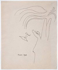
I recently visited an exhibit of Andy Warhol (1928-1987) at a local art museum. A retrospective, it covered the wide range of his work--from Celebrity Portraits (Michael Jackson with his 'Thriller' nose) to the Soup Cans to his Screen Test films. But of all the work on display, I found myself pulled to his early drawings. Done well before his extended 15 minutes of fame, when he was employed as a young illustrator and graphic designer for department stores, their delicate form and expressive lines were the antithesis of his later and more famous ironic and cooly distant pop art. Whether it was ladies shoes or a cat sleeping or a portrait of a friend, the tenderness, humanity, and affection for the subject came out in the whimsical turn of a curve or the sensuous tracing of a form. This revealed to me an Andy I could imagine as a person I could talk to, who was engaged with his art and not standing back as voyeur and critic.
It also brought to mind several other artists who have mastered that delicate balance of economy of line and sensual expressiveness.
Aubrey Beardsley (1872-1898) took linework to baroque excess. His pen-and-ink works are filled with dots and curlicues and bold patches of solid black, forming a hallucinatory Art Nouveau fantasy world. Often connected with the writings of Oscar Wilde, his drawings embody the fin-de-siècle decadence that was bringing the 19th century to an end.
Pablo Picasso (1881-1973) was a genius in whatever medium he chose. His line drawings are at once primitive and sophisticated. Calling forth mythological figures like satyrs, minotaurs, and nymphs, his drawings brought out a raw sexuality without vulgarity.
Then there is my favorite (and the inspiration for this site), Jean Cocteau (1889-1963). Essentially a poet who expressed himself through drawing, painting, sculpture, theater, film, and writing, Jean lived in a dream world and the real world simultaneously. As evidenced in his films like Orphée, the two are only separated by a thin membrane, breached as easily as water. He often drew sensual and erotic drawings of young men, who were either dreaming or half-asleep. Even those with their eyes open seemed to be transfixed by some far off vision, practically blinding them.
It is this most primitive form of art, the black line on a blank sheet, that holds the most power for me. The line carves form out of the void and creates a tension between inside and out, black and white, surface and mass. This is the energy that brings art its life force.
Subscribe to:
Posts (Atom)